


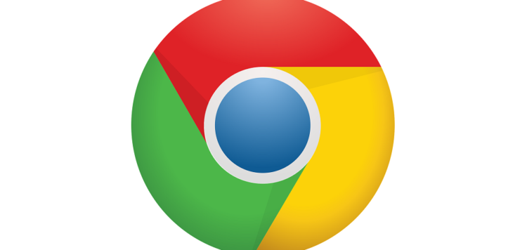
For the first time in eight years, Google is changing its Chrome browser logo, adopting a simpler look intended to better match Google’s current brand, a company designer said Friday. But you might not even notice.
It’s got the same general scheme as the circular, four-color basic design that arrived in 2009 with the very first Chrome and that Google flattened in a 2011 revamp. But subtler changes are now on the way to your screens. The new logo has brighter colors, a larger blue circle in the center and no more shadows.