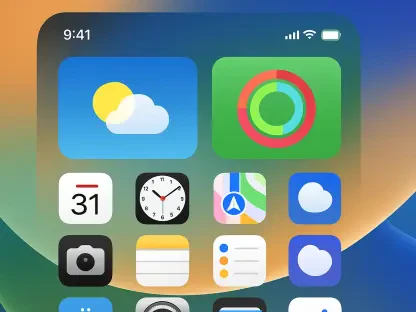

A subtle yet significant feature discovered deep within early development builds of Android’s next major release provides a clear window into Google’s evolving strategy for its mobile operating system. Codenamed “windowBlur” and anticipated for the upcoming Android 17, this native system-level capability is designed to introduce a high-performance background blur effect, an aesthetic hallmark long associated with the polished user interface of Apple’s iOS. The emergence of this feature signals a pivotal shift in Google’s design philosophy, one that increasingly prioritizes refined visual elements as a key competitive differentiator in the relentless battle for mobile supremacy. This move is more than a simple cosmetic enhancement; it represents a foundational change aimed at elevating the entire Android user experience, moving it from a platform celebrated for its functionality to one that also competes on the grounds of sophisticated design and aesthetic cohesion.
A System-Level Overhaul for Developers and the Ecosystem
Empowering Developers with Native Tools
For years, Android developers seeking to implement a visually appealing background blur effect faced a frustrating dilemma, forcing them to rely on cumbersome and performance-intensive workarounds. The conventional method involved programmatically capturing a bitmap of the content behind a window, processing it with a computationally expensive blur algorithm, and then setting that blurred image as the window’s background. This multi-step process was not only difficult to implement correctly but frequently introduced noticeable performance bottlenecks, such as laggy animations, stuttering transitions, and increased power consumption. Consequently, many developers opted to forgo this desirable visual effect entirely, deeming the performance trade-off too great a risk for the user experience. This technical barrier has long been a pain point within the developer community, limiting the creative potential for user interface design and preventing many apps from achieving a more modern, layered appearance.
The introduction of a native Application Programming Interface (API) for “windowBlur” directly within the Android WindowManager is a transformative development that promises to resolve these long-standing challenges. By integrating this functionality at the core of the operating system—the very system responsible for drawing and managing application windows on screen—Google provides a highly optimized and hardware-accelerated solution. This native implementation offloads the complex rendering work to the system, ensuring smooth, efficient performance without the battery drain associated with older methods. For developers, this means adding a sophisticated “frosted glass” effect will become as simple as enabling a single window flag. This democratization of a previously complex design feature is set to encourage its widespread adoption, empowering developers of all sizes to create more visually rich and polished applications with minimal effort, thereby raising the aesthetic standard across the entire app ecosystem.
Unifying a Fragmented Visual Landscape
One of Android’s persistent challenges has been its visual fragmentation, a side effect of its open-source nature that allows hardware manufacturers to heavily customize the software. In the pursuit of brand differentiation, companies like Samsung with its One UI and Xiaomi with its HyperOS have developed and integrated their own proprietary background blur implementations. While these custom solutions enhance the user experience on their respective devices, they create a disjointed and inconsistent visual language across the broader Android ecosystem. An application could feature beautiful, translucent blur effects on a Samsung Galaxy device but appear flat and dated on a Google Pixel or a phone from another manufacturer that sticks closer to the stock Android experience. This inconsistency undermines the goal of a cohesive platform identity and can lead to a user perception that Android lacks the uniform polish of its main competitor.
By standardizing the “windowBlur” feature within the Android Open Source Project (AOSP), Google is taking a decisive step toward creating a more unified and consistent visual experience for all users. Making this sophisticated effect a standard, readily available component of the core operating system ensures that developers can implement it with confidence, knowing it will look and perform as intended regardless of the device manufacturer. This move is crucial for elevating the perceived quality of the Android platform as a whole, fostering an environment where apps feel more integrated and inherently part of a single, premium ecosystem. A consistent design language not only benefits users by providing a predictable and more enjoyable experience but also simplifies the development process, allowing creators to focus on building great features rather than wrestling with platform-specific visual inconsistencies. This effort to harmonize the look and feel of Android is a key part of its maturation.
The Strategic Play Against a Key Rival
Closing the Aesthetic Gap with iOS
The development of a native, system-wide blur capability is an undeniable and direct strategic response to a key aesthetic advantage long held by Apple. For over a decade, iOS has masterfully employed blur and translucency effects as a foundational element of its design language. From the layered panes of the Control Center to incoming notifications and system alerts, this “frosted glass” effect creates a sense of depth, context, and visual hierarchy that contributes significantly to the perception of iOS as a more refined and design-forward operating system. This consistent and elegant visual cue has become a signature part of the iPhone user experience, subtly reinforcing the premium quality associated with the brand. By engineering a comparable, high-performance feature directly into the Android framework, Google is methodically working to neutralize this long-standing design disparity and challenge the narrative that Android lags behind in visual sophistication.
This focus on aesthetic detail is particularly critical in the current smartphone market, where the hardware capabilities of flagship devices from different manufacturers have largely converged. With processors, cameras, and displays offering increasingly similar levels of performance, the software experience has emerged as the most important differentiator for consumers. The introduction of “windowBlur” is a clear indication that Google understands this shift and is committed to competing not just on technical specifications, features, and platform openness, but also on the more nuanced, subjective aspects of user experience that inspire delight and foster brand loyalty. It is a calculated investment in the subtle design elements that, when combined, define a user’s overall perception of a product’s quality and craftsmanship, signaling a new chapter in the ongoing rivalry between the two dominant mobile platforms.
The Maturation of Android’s Design Language
This initiative is best understood as the next logical progression in the overarching evolution of Android’s design philosophy, a journey that gained significant momentum with the introduction of Material Design under the leadership of Matías Duarte. That system marked a turning point, establishing a comprehensive set of principles for motion, layout, and interaction that brought a much-needed sense of order and beauty to the platform. The “windowBlur” feature builds upon this foundation, moving beyond static guidelines to embed sophisticated visual capabilities directly into the operating system’s core. This signifies more than just the addition of another visual effect; it represents the ongoing maturation of Android into a truly design-conscious platform that strives for a holistic, elegant, and seamlessly integrated user experience where software and hardware work in perfect harmony.
The discovery of the “windowBlur” feature ultimately provided a compelling glimpse into Google’s forward-looking strategy for Android. Although its inclusion in the final public release of Android 17 remained unconfirmed—as the feature was in an early, experimental state and disabled by default—its mere existence was profoundly telling. It pointed to a multi-faceted approach aimed at empowering developers with efficient new tools, unifying the user experience across a fragmented device ecosystem, and directly challenging a key aesthetic advantage long held by Apple. This deliberate investment in the subtle yet crucial details of interface design showcased a continued commitment to the overall maturation of Android into a world-class operating system that competed not only on power and openness but also on polish and delight.