
Imagine a world where every swipe, tap, and glance at an iPhone screen feels like a step into a meticulously crafted digital gallery. Apple is set to redefine this experience with the upcoming release of iOS 26, promising a visual overhaul that could reshape the way users interact with their devices. This update marks a significant milestone, as it introduces the first major redesign of system app artwork since the transformative shift seen over a decade ago. Slated for release this fall, the redesign focuses on refreshing app icons, buttons, and tab bars, aiming to create a unified aesthetic across the iPhone home screen and beyond. More than just a surface-level change, this initiative reflects Apple’s dedication to design excellence, ensuring that every visual element aligns with a broader vision of innovation. As anticipation builds, the tech community is eager to see how these changes will influence not only user experience but also the broader perception of Apple’s iconic design language across its ecosystem.
Unifying Design Across Platforms
One of the most striking aspects of the iOS 26 redesign is Apple’s commitment to creating a cohesive visual identity across its diverse operating systems. For years, discrepancies in design language have been evident, with macOS icons often featuring three-dimensional effects and shadows, while watchOS and visionOS leaned toward circular shapes that clashed with the iOS style. This update seeks to bridge those gaps by standardizing icon designs, particularly adopting the signature ‘squircle’—a rounded rectangle shape—across iOS and macOS for a harmonious look. Meanwhile, watchOS and visionOS icons will mirror their iOS counterparts with slight modifications, such as cropping into circular formats to suit their unique interfaces. This thoughtful synchronization eliminates the fragmented appearance of past designs, offering users a seamless visual experience whether they’re on an iPhone, Mac, or Apple Watch. The result is a polished ecosystem where every platform feels like part of the same family, reinforcing Apple’s reputation for meticulous attention to design consistency.
Elevating Aesthetics with Innovation
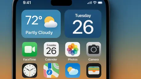
Beyond unification, the iOS 26 redesign introduces cutting-edge graphic techniques that promise to elevate the visual and interactive experience to new heights. Apple has incorporated glass layers into app icons, creating subtle edge highlights and blur effects that add depth and sophistication. The squircle shape itself has been refined with a larger corner radius for a sleeker appearance, while new alignment guidelines ensure uniformity across the board. A particularly innovative feature is the dynamic response of these glass layers to device motion on iPhones and iPads, producing directional light effects that bring a modern, tactile dimension to the interface. User feedback on these changes has been overwhelmingly positive, with many praising the revamped icons for apps like the App Store, Mail, Music, and Weather as significant improvements over previous iterations. This enthusiastic response highlights Apple’s success in blending form with function, crafting a design language that not only looks stunning but also enhances usability through thoughtful, interactive elements.