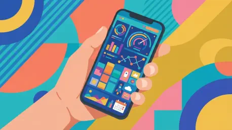

Navigating the modern smartphone interface often feels like an exercise in digital archeology as users dig through layers of menus just to find a single relevant piece of information. Most individuals treat their home screens as simple grids of icons, occasionally punctuated by a large clock or a weather forecast, yet the potential for a more dynamic and responsive environment remains largely untapped. While the tech giants provide the foundation, a dedicated community of creative developers has moved far beyond the basic offerings to redefine how information is consumed and tasks are executed. The goal of this evolution is not merely to change the aesthetic of a device but to fundamentally reduce the friction inherent in modern mobile computing. By moving away from the traditional app-launching model, users can transform their devices into real-time dashboards that respond to their specific needs without a single wasted tap.
The importance of this shift cannot be overstated in an era where digital fatigue has become a common byproduct of poorly designed user experiences. From 2026 to 2028, the industry trend is moving decisively toward a “glanceable” interface where the barrier between the user and their data is almost non-existent. This transition represents a significant departure from the siloed application model that has dominated the landscape since the inception of the modern smartphone. Instead of forcing the user to adapt to the constraints of various apps, the most advanced widget strategies allow the device to adapt to the user’s workflow. This narrative is not about minor adjustments but about a comprehensive reimagining of the mobile interface as a tool for immediate, low-friction interaction.
Beyond the Static Square: Why Your Home Screen Is Ready for a Revolution
The contemporary home screen often resembles a graveyard of intentions, filled with icons that represent tasks rather than the data those tasks require. Most Android users have grown accustomed to treating widgets as oversized, non-interactive decorations that provide the bare minimum of utility. However, the current technological landscape demands a more sophisticated approach where the home screen functions as an active participant in a user’s productivity. The revolution lies in the ability to bridge the gap between static information and actionable intelligence, allowing for a seamless transition between viewing data and interacting with it. As the ecosystem matures, the focus has moved from merely having widgets to optimizing their placement and accessibility.
This shift toward more functional home screens is driven by the realization that opening an entire application for a two-second check of a calendar or a task list is a massive inefficiency. For years, the limitations of the widget framework led many to abandon the feature entirely, favoring the speed of notifications or the familiarity of icon grids. But the revival of the system has brought a new level of depth that rewards those willing to experiment with unconventional layouts. The revolution is characterized by a move toward minimalist designs that hide complexity until it is needed, ensuring that the most powerful tools remain invisible yet instantly accessible.
The result of this modern philosophy is a home screen that feels less like a wall of advertisements for apps and more like a tailored control center. When a device is configured correctly, it anticipates the user’s requirements and presents relevant information based on context, time, and location. This level of customization was once the domain of technical enthusiasts, but the tools available today have made it accessible to anyone looking to refine their digital life. By embracing this change, the user transitions from being a passive consumer of app interfaces to an architect of their own mobile experience, building a system that respects their time and attention.
The Long Road: From Abandonment to Android’s Greatest Advantage
The history of Android widgets is a narrative defined by moments of brilliant inspiration followed by long periods of corporate indifference. Initially, widgets were the primary differentiator that set Android apart from its competitors, offering a level of customization that was unheard of in the early mobile era. However, as the operating system evolved, the widget framework was largely left to stagnate, with little innovation occurring between the early iterations and the major design overhaul that arrived years later. This period of stagnation allowed other parts of the interface to take precedence, leaving widgets to feel like an outdated relic of a previous design philosophy.
The situation changed dramatically in 2021 when a renewed focus on design and personalization brought widgets back into the spotlight with the introduction of more flexible and aesthetically pleasing frameworks. Since that turning point, the trajectory has been one of consistent improvement, with the current year of 2026 marking a peak in the developer community’s ability to manipulate the system. The true advantage of Android today is not just the presence of widgets, but the inherent flexibility of the underlying OS that allows third-party tools to interact with those widgets in ways the original designers never imagined. This openness has fostered an environment where niche productivity needs can be met through creative software combinations.
Today, widgets are recognized as the last frontier of mobile efficiency because they provide a way to interact with data without the cognitive load of switching contexts. The friction of the app model—where a user must exit their current task, find an icon, wait for a splash screen, and then navigate a complex internal menu—is the primary cause of digital burnout. In contrast, the current widget ecosystem allows for a layer of interaction that sits on top of the OS, providing immediate utility. As developers continue to push the boundaries of what is possible, the widget has evolved from a simple clock or weather tile into a sophisticated portal that connects users directly to their most vital workflows.
Unconventional Strategies: Supercharge Your Widget Experience
The most significant hurdle to a high-utility home screen is the limited amount of real estate available, but the first unconventional strategy involves using tools like Popup Widget to circumvent this physical constraint. This method allows any standard widget to be converted into a simple, non-intrusive icon that only reveals its full functionality when tapped. By using this approach, a user can maintain a perfectly clean wallpaper while keeping complex tools like an interactive email inbox or a full financial ledger just one tap away. When the interaction is finished, the widget vanishes, preventing the home screen from ever feeling cluttered or disorganized.
For those who find themselves constantly switching between applications, utilizing system-wide edge gestures provides a way to summon widgets regardless of what is currently on the screen. By integrating gesture-control apps with pop-up utilities, it is possible to assign a specific motion—such as a downward swipe along the side of the display—to trigger a floating widget window. This allows a person to check their daily schedule or adjust smart home settings while in the middle of a video call or a web browsing session. The ability to overlay information on top of an active task without leaving that task is a major leap toward true mobile multitasking.
Innovation also extends to the hardware itself, where the often-ignored camera cutout can be transformed into a functional control hub. Specialized software can map actions like long presses or swipes across the “hole punch” camera to trigger specific widgets or panels. This repurposes what was once a design compromise into a tactile shortcut that offers quick access to essential data. Similarly, physical volume buttons can be remapped to act as triggers for digital tools, providing a level of physical feedback that touchscreens cannot replicate. This tactile approach is particularly beneficial for tools like voice recorders or quick-note panels that may need to be accessed in environments where looking at the screen is not ideal.
Maintaining constant interaction during complex workflows can be further enhanced by using floating bubble systems that keep a widget visible as a small, movable icon. This method is inspired by notification bubbles but applies the same logic to full widgets, allowing them to follow the user across multiple apps. Finally, for those who prefer a more traditional home screen layout, the use of widget stacks offers a way to consolidate space. By layering multiple widgets on top of each other, users can swipe through different sets of data within a single footprint. This allows for a density of information that would otherwise require multiple screens, keeping everything categorized and accessible without the chaos of a crowded interface.
Expert Insight: The Philosophy of Frictionless Mobile Use
Productivity experts emphasize that the primary goal of any mobile configuration should be the reduction of “interaction cost,” which is the sum of mental and physical effort required to complete a task. The traditional app-centric model has a high interaction cost because it forces the brain to shift gears every time a new window opens. By moving toward a widget-based interface, users are essentially adopting a “glanceable” philosophy that prioritizes immediate awareness over deep immersion. This design logic argues that if an action takes more than three seconds to initiate, the system has failed the user’s need for efficiency.
Industry analysts note that the shift toward these “wild” widget configurations is a response to the overwhelming amount of data people must manage daily. A well-configured Android device acts as a filter, surfacing only what is necessary at a given moment while hiding the rest. Developers have observed that users who implement gesture-based or stacked widget systems report a significant decrease in “digital friction,” leading to a more focused and less frantic relationship with their technology. The goal is to move away from the device as a source of distraction and toward the device as a transparent tool that aids in the completion of real-world goals.
Ultimately, the philosophy of frictionless use is about reclaiming the home screen from the developers who want to maximize “time spent in app” and giving it back to the users who want to maximize results. By utilizing these unconventional methods, a user is no longer constrained by the default behaviors of the operating system. Instead, they are empowered to create a custom environment where the most important information is always within reach, whether it is through a hidden gesture, a physical button, or a floating bubble. This approach transforms the smartphone into a highly personalized extension of the user’s own cognitive process, streamlined for a high-speed digital world.
Practical Framework: A Strategic Approach to Implementation
The transition toward a high-efficiency widget system was defined by a systematic evaluation of how digital tools were used throughout the day. The process began with an audit that identified which applications were opened most frequently for a single, fleeting piece of information. By recognizing these patterns, the necessity of the “app model” was challenged, and the most vital data points were selected for widget conversion. This foundational step ensured that the resulting home screen was not just a collection of new features but was built upon the actual needs of the individual.
Once the essential data was identified, the selection of the appropriate trigger mechanism became the primary focus. The strategy involved matching the frequency of the task with the most ergonomic gesture or button, ensuring that high-priority information remained the easiest to access. Triggers like the camera cutout or physical button mapping were reserved for the most urgent tasks, while edge gestures and pop-up icons managed secondary tools. This tiered approach to accessibility created a logical hierarchy of information that felt natural to use and required minimal memorization.
The final phase of the framework addressed the physical organization of the interface through the use of stacks and overlays to maintain visual clarity. Permission settings were refined to allow for seamless system-wide interaction, ensuring that the chosen utilities had the necessary authority to display over other applications. The successful implementation of these strategies turned the device into a more responsive and less demanding tool, shifting the focus from navigating the phone to acting on the information it provided. This transformation represented a clear departure from standard mobile habits and established a more intentional and efficient way of interacting with technology.