
Imagine scrolling through your iPhone home screen and noticing a striking transformation—app icons that shimmer with subtle motion, exude a polished glass-like texture, and align seamlessly across all your Apple devices. This is the reality of the latest iOS update, a visual overhaul that has sparked intense discussion among tech enthusiasts, designers, and everyday users. This roundup dives into the sweeping redesign of app icons, gathering diverse perspectives, expert insights, and practical tips to uncover how this update reshapes the user experience across Apple’s ecosystem. The goal is to present a balanced view of the changes, exploring both the aesthetic triumphs and potential challenges.
Diving into the Visual Shift Across Apple’s Platforms
Harmonizing Design: A Unified Look for All Devices
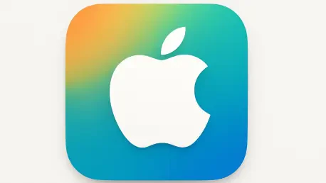
One of the most talked-about aspects of this update is Apple’s push for consistency across its ecosystem, including iOS, iPadOS, macOS, watchOS, and visionOS. Industry observers note that the adoption of a standardized ‘squircle’ shape for iPhone and Mac icons, alongside tailored circular designs for watchOS and visionOS, marks a significant departure from the previously fragmented styles. This move aims to create a cohesive visual identity, ensuring users feel a sense of familiarity whether they’re on a phone or a smartwatch.
Design professionals have largely praised this unification, highlighting how new guidelines—such as glass layers for edge highlights and precise alignment rules for circular elements—bring a refined sophistication to the interface. The larger corner radius of the squircle shape softens the overall look, aligning with modern minimalistic trends. However, some voices in the design community question whether this standardization sacrifices the unique character of individual platforms, suggesting that a one-size-fits-all approach might dilute platform-specific charm.
A point of contention arises when considering smaller developers who must now adapt to these strict design rules. While major system apps like Safari, Messages, and Photos seamlessly integrate into the new aesthetic, independent app creators might struggle to align their icons without losing brand identity. This debate underscores a broader tension between uniformity and creative freedom in Apple’s tightly controlled ecosystem.
Dynamic Effects: Adding Life to Static Icons
Another focal point of discussion centers on the interactive elements introduced in iPhone and iPad icons. Tech reviewers have been captivated by how glass layers respond to device motion, casting subtle directional light effects that breathe life into the user interface. This feature transforms static icons into dynamic components, enhancing engagement with every tilt or swipe.
Many in the tech sphere commend Apple’s attention to detail, noting that even without these motion effects, the updated icons appear more polished compared to earlier versions. The consensus among visual design experts is that this level of craftsmanship sets a high bar for competitors, pushing the industry toward more tactile and responsive interfaces. Such innovations are seen as a testament to Apple’s commitment to elevating user interaction through design.
Yet, not all feedback is glowing—some user communities raise concerns about the potential impact on battery life due to these dynamic effects. Accessibility advocates also point out that motion-sensitive users might find the animations distracting or disorienting, prompting calls for customizable settings to disable such features. This mix of admiration and critique highlights the delicate balance between aesthetic innovation and practical usability.
Modern Shapes and Textures: A Step Toward Minimalism
The redesign also introduces a softer squircle shape paired with glass blur effects, a nod to current design trends favoring depth and simplicity. Industry trend analysts observe that this shift aligns Apple with broader movements in tech design, where polished, tactile interfaces dominate. The updated look of system apps is often described as sleek and futuristic, reinforcing Apple’s reputation for cutting-edge aesthetics.
Comparisons to competitors reveal that Apple’s focus on visual cohesion might inspire similar overhauls in other ecosystems, potentially setting a new standard for app icon design. Some graphic designers argue that this emphasis on minimalism and texture not only enhances visual appeal but also subconsciously guides users through interfaces with clearer hierarchies. This perspective positions the update as more than just cosmetic—it’s a strategic design evolution.
However, a smaller but vocal group of usability experts challenges whether these aesthetic changes translate to functional improvements. Questions linger about whether the focus on style overshadows critical usability enhancements, especially for users who prioritize efficiency over visual flair. This ongoing discussion invites a deeper look into how design trends influence practical interaction in daily use.
Rollout and Reception: Accessibility in Focus
The practical rollout of the update has also garnered attention, with iOS and iPadOS now accessible to all users through automatic updates or manual installation via Settings. Tech blogs and forums report a generally smooth deployment, covering a wide array of system apps from App Store to Weather. Users eager to explore the new look are often directed to update manually for immediate access to the refreshed interface.
Public reception, as gathered from online communities, varies widely—while many celebrate the modernized icons as a breath of fresh air, others express nostalgia for older, platform-specific designs. Accessibility remains a hot topic, with some users on older devices questioning whether the update fully supports their hardware capabilities. This diversity in opinion reflects the challenge of catering to a vast and varied user base with a single design vision.
Advocates for inclusive design stress the importance of ensuring that the rollout accommodates diverse needs, from visual impairments to device limitations. Suggestions for Apple include offering toggle options for dynamic effects or providing scaled-down versions for older models. These insights emphasize that a successful redesign must prioritize equitable access alongside visual innovation.
Key Takeaways from Varied Perspectives
Synthesizing the range of opinions, several key themes emerge from the app icon overhaul. The drive for cross-platform harmony stands out as a bold step toward a unified visual language, with the squircle shape and glass effects earning widespread acclaim for their modern appeal. Dynamic interactivity adds a layer of engagement, though it comes with caveats around battery use and accessibility.
Practical tips for users include navigating to Settings under General and Software Update for a manual installation if the automatic rollout hasn’t yet reached their device. Additionally, exploring community forums can offer valuable peer insights on adapting to the new interface, especially for those encountering minor glitches or seeking customization options. Staying informed about potential patches or settings adjustments can also ease the transition.
For developers and designers, the update presents both an opportunity and a challenge to align with Apple’s stringent guidelines while maintaining unique app identities. Engaging with design communities or Apple’s developer resources can provide clarity on best practices for icon creation under the new rules. These actionable steps ensure that all stakeholders can navigate the redesign effectively.
Reflecting on the Impact and Next Steps
Looking back, the discourse surrounding the iOS 26 app icon redesign reveals a complex tapestry of admiration, critique, and practical considerations. The unified aesthetic captivated many, while concerns about accessibility and functional balance reminded the industry of the diverse needs within Apple’s user base. This roundup captures a pivotal moment in tech design, where visual innovation intersects with real-world application.
Moving forward, users and developers alike can benefit from actively monitoring updates or patches that address initial rollout challenges, particularly around accessibility features. Exploring Apple’s support channels for tailored guidance on older devices or specific user needs can also enhance the experience. For those in the design field, contributing to ongoing discussions about balancing uniformity with individuality could shape future iterations of Apple’s visual language, ensuring that innovation continues to serve all.