
When it comes to mobile technology and personalization, few experts rival Nia Christair. With a deep background in mobile gaming, app development, device hardware design, and enterprise mobile solutions, Nia has a unique perspective on how innovations like iOS 26 are reshaping the way we interact with our devices. In this interview, we dive into the latest customization features of iOS 26, exploring everything from groundbreaking icon designs to immersive lock screen effects and AI-driven spatial scenes. Nia breaks down how these tools empower users to create truly personal and dynamic iPhone experiences.
How does the new “Liquid Glass” design in iOS 26 redefine icon customization?
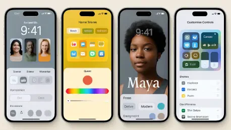
The “Liquid Glass” design is a game-changer for how icons appear on your iPhone. It introduces a translucent effect that gives icons a sleek, almost floating look, blending seamlessly with your wallpaper. It’s not just about aesthetics—it makes the home screen feel more integrated and modern. This design adds a layer of depth that wasn’t there before, making your device feel more alive and tailored to your style.
Can you walk us through how users can activate and tweak this translucent icon effect?
It’s pretty straightforward. Just press and hold an empty spot on your home screen, tap “Edit,” then “Customize,” and you’ll see the “Translucent” option. From there, you can play with settings like light or dark backgrounds and choose between small or large icon sizes. It’s all about giving users flexibility to match the look to their vibe, whether they prefer minimalistic or bold designs.
What’s exciting about the tinted mode for icons, and how does it connect to personal style?
Tinted mode is where personalization gets really fun. It lets you pick custom colors for your icons based on your wallpaper or even your phone case. Imagine having a cohesive color scheme that ties everything together—it’s like curating your own digital aesthetic. This feature taps into the desire for self-expression, letting users make their iPhone a true reflection of their personality.
Turning to the lock screen, what’s new with personalization options in iOS 26?
The lock screen in iOS 26 has gotten a massive upgrade. You can access the new features either through Settings under Wallpaper or by long-pressing the lock screen and hitting “Edit.” What’s cool is how much control you have now—everything from dynamic clock sizing to effects that interact with your wallpaper. It’s not just a static screen anymore; it’s a canvas for creativity.
Can you elaborate on the dynamic clock sizing and how it enhances the lock screen experience?
Dynamic clock sizing is all about adaptability. The clock can scale and shift based on your wallpaper, creating a depth effect that makes it look like it’s sitting behind or in front of elements in the image. This interaction adds a sophisticated, almost 3D feel to the lock screen, turning a simple time display into a visual statement that feels unique to each user.
Let’s talk about the AI-powered spatial scenes. How do these 3D effects bring a new dimension to the iPhone?
Spatial scenes are one of the standout features of iOS 26. They’re AI-generated 3D effects that respond to how you move your phone, creating an immersive experience. You enable them by tapping the hexagon icon in the customization menu, and suddenly your wallpaper isn’t just flat—it feels alive. It’s like having a little world on your screen that shifts with every tilt, making the interaction with your device feel incredibly dynamic.
How much control do users have over these spatial scenes, especially with gestures?
Users have a surprising amount of control. You can fine-tune the depth effect with pinch gestures, adjusting how pronounced the 3D layers are. There are also options to tweak wallpaper positioning and transparency, so you can decide exactly how subtle or dramatic the effect feels. It’s empowering because you’re not stuck with a preset—you’re crafting the experience yourself.
What are some of the standout options for widget integration and clock customization in this update?
The clock customization in iOS 26 is incredibly detailed—you’ve got multiple font styles, weights, and even effects like glass or solid appearances. You can also pick custom colors to match your theme. As for widgets, they’ve been repositioned with depth integration in mind, so they don’t just sit on the screen; they feel layered with the rest of your design. It’s a small tweak, but it makes the whole interface feel more cohesive and polished.
How do the advanced display options in iOS 26 help create a seamless look across the device?
These advanced display options are all about consistency. They ensure smooth transitions between your lock screen and home screen, so there’s no jarring shift in style. Features like intelligent widget placement mean your widgets automatically adjust to fit the design, while dynamic visual effects—like those tied to music playback—add subtle animations that enhance the experience. The multilayered designs also boost depth perception, making everything feel more tactile and intentional.
Looking ahead, what’s your forecast for the future of personalization in mobile interfaces like iOS?
I think we’re just scratching the surface with personalization in mobile interfaces. With advancements in AI and augmented reality, I expect future iOS updates to push even further into interactive and adaptive designs—think wallpapers or interfaces that change based on your mood, location, or time of day. We’ll likely see deeper integration with accessories and wearables, too, creating a truly holistic ecosystem. The goal will always be to make technology feel like an extension of who you are, and I’m excited to see how Apple and others innovate in this space.